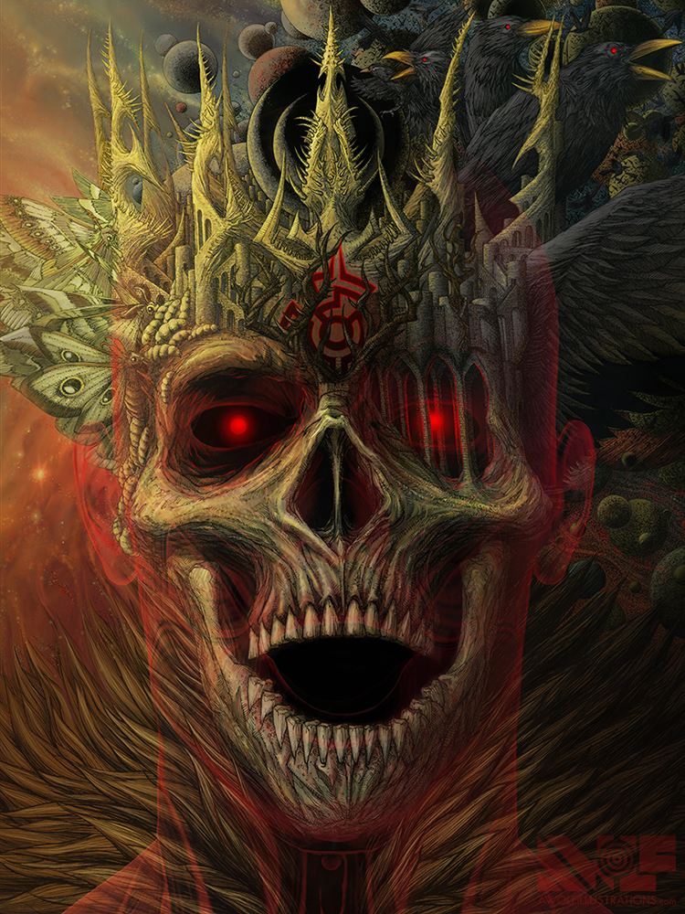
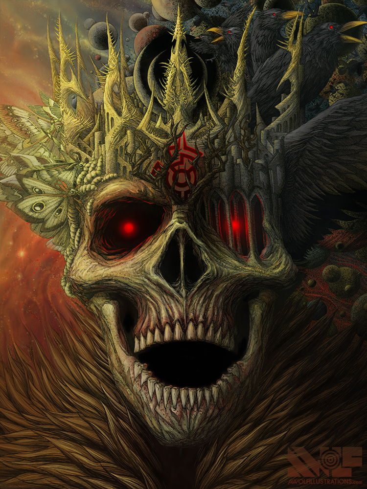
After sitting on this one for 4 or 5 months I decided to give a crack at colouring this, as it has been a while since I have coloured anything digitally. The colour scheme I used is a bit different then my usual palette as it is a bit more muted and earthy. I thought at first the colours I had chosen would be to complicated and make the illustration even more complicated, rendering it muddled and unreadable. This, however, was not the case, as I think I lets everything have its own space and quadrant, while the yellow/gold and blue pulling it in together. I also did some experimenting with the design by adding a sort of musculature “ghost” overtop of the kings face to try but ultimately abandoned it as, I thought, although it added to the creepy element, it ended up covering up much of the design and distracting.

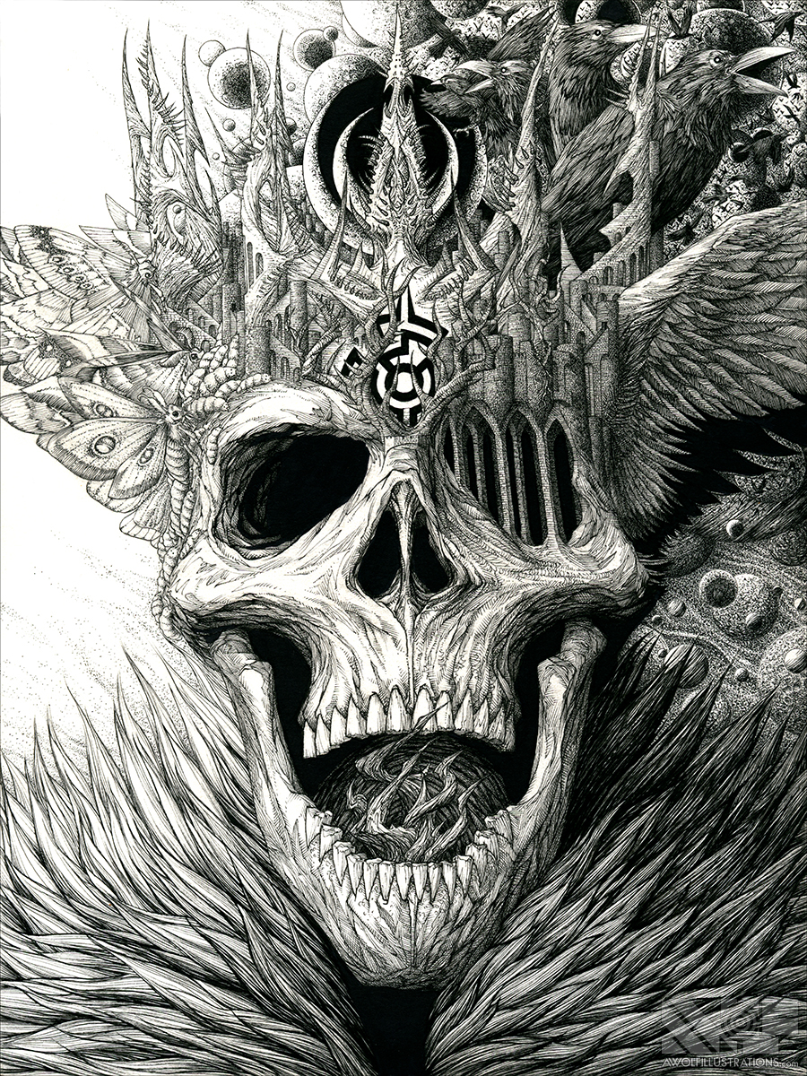
Here is the original ink drawing so you can see the detailed pen work I did by hand before colouring on Photoshop. You can see some of the process and the steps that went into drawing by clicking the image or HERE. Also the original 9 x 12″ ink drawing is for sale in the STORE.


[…] For this image I added the neck and collarbones and the halo of bones behind the King, as originally, the fur dominated the bottom third and made for an uninteresting portion for a puzzle. To see the process for this artwork, including the original ink drawing, CLICK HERE. […]