I have recently just completed a logo design for a contracting company operating out of Vancouver, British Columbia called Caledonia Contracting. Caledonia is the Latin name that was given to what today is Scotland by the Romans when the Roman Empire spread up into Britain. The client came with the idea that he would like to use a rook from a chess set in the design as it is bold, symbolises strength and durability, calls back to the name and time relating to the name of the company, and also relates to construction and shows that solid construction can stand the test of time. The colours I chose to use also reflect the colours of the Scottish flag, and are bold and look less menacing then a black castle.
If you are located in Vancouver, British Columbia and need a contractor for new construction, remodelling or renovation, I highly recommend getting in touch with Nick at Caledonia Contracting. I am not just saying this because he hired me to design his logo but because I have seen his work and I know he takes pride in his work and is a great guy to work with.
Below are a few other logo designs that I created on the way to getting to the final logo design. In the end we worked together to come up with the best logo but I think some of these warrant being shown, both because I still feel they are successful designs but also so you can see some steps that I take along the way on getting to a finished design.
![]()
I am also using this blog to share older work that I do not want to include in the main GALLERY as I do not think it fits in thematically with the other work. I will use this BLOG to show this older work and archive it so it can still be found on this site.
This is the first logo I did that I was very happy with and thought looked professional. This logo is nearly 10 years old now and was a now defunct company that specialised to creating unique jewellery designed from wood.
![]()
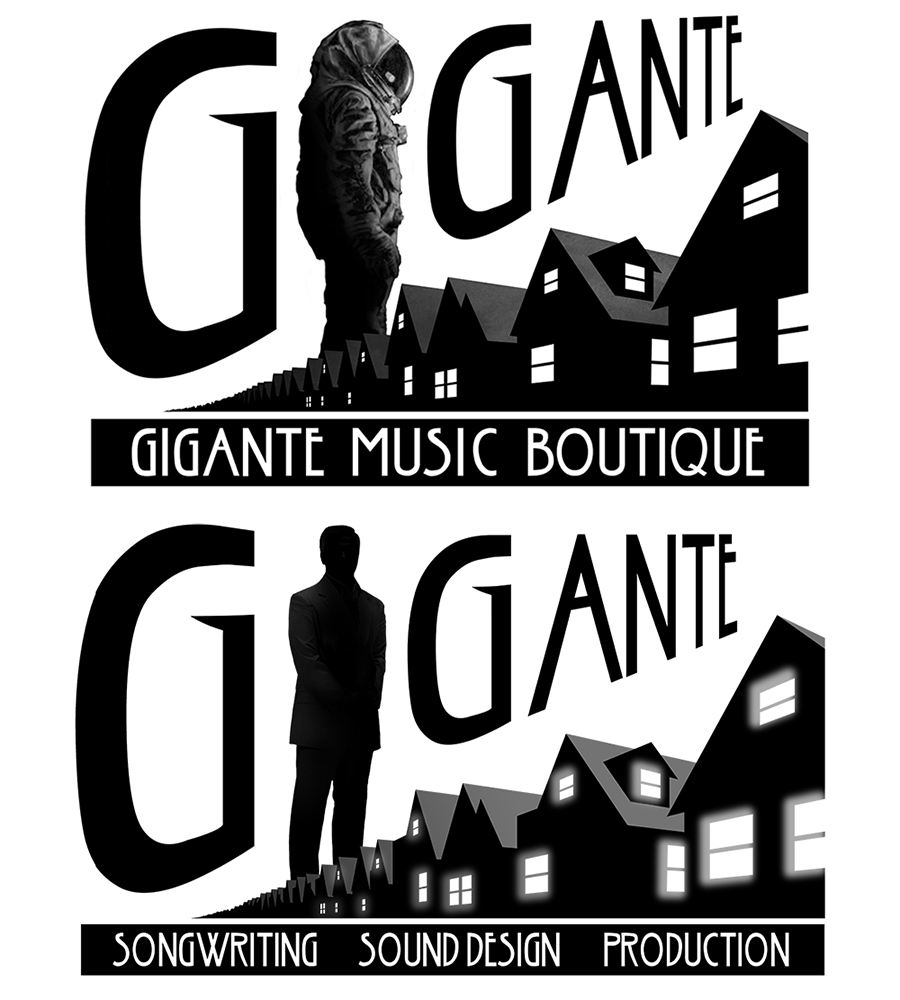
This was a logo for a sound design and commercial music production company out of Vancouver, that worked on various projects for video games and television. The top logo with the astronaut was the final version that they went with and the businessman lurking over the suburbs was a design I did on the way to the final product.
This was also a logo designed for a Australian company that made wooden household knick knacks, such as chopping boards and coasters from recycled wood. These where my four submissions and in the end I’m not sure which logo design they ended up using.
![]()
This logo was also for a company in Australia. It was designed for a farm up in Northern Queensland which was to be used for products sold in supermarkets in northern Australia.

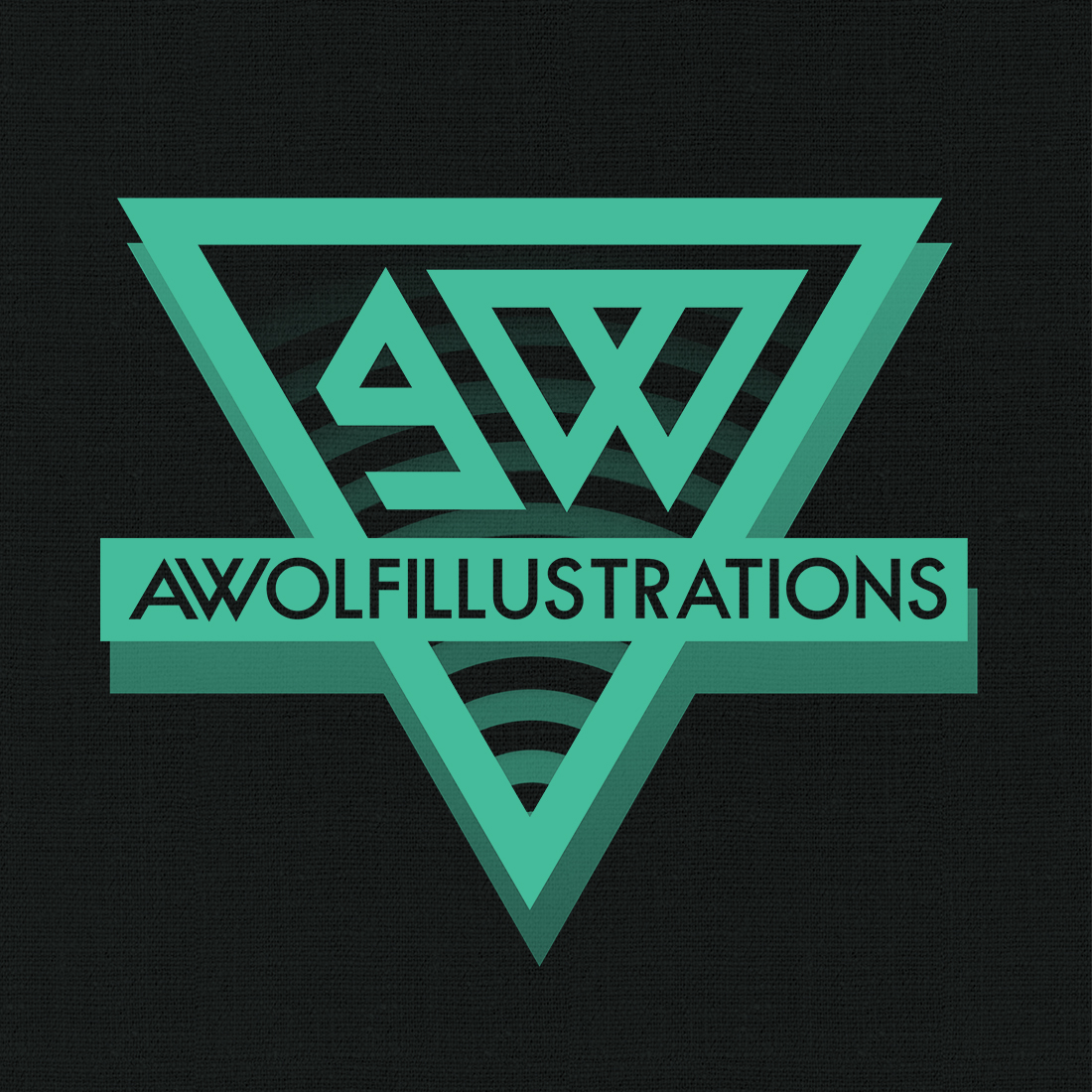
These logos are what I ended up designing for myself when I redesigned my website. The one on the left I designed about four years ago when I first took a stab at redesigning my site, and made some minor alterations to when I started redesign for this version of my website in early 2018. The second logo on the right comes from this same time when I was trying to see if I could come up with a better design. I like both but I prefer the one on the left as it is bolder and easier to recognised when reduced to a small size. That was essential as I now watermark my artwork with this so that my artwork can be traced back to my website and people know who produced it.
![]()


Leave A Comment
You must be logged in to post a comment.